Post by Okafor Ikechukwu (@innoiyke)
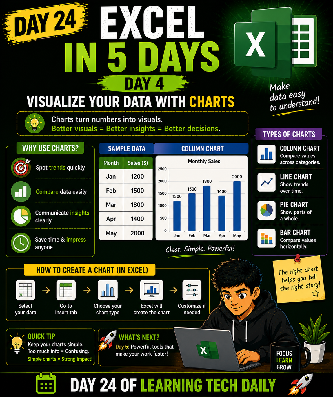
Excel in 5 Days — Day 4
Numbers are good…
But charts make data easier to understand.
With charts, you can:
✅ Spot trends fast
✅ Compare values easily
✅ Present insights clearly
Common chart types:
Column chart
Line chart
Pie chart
Bar chart
To create a chart in Excel:
Select your data
Go to Insert
Choose a chart type
That’s it.
Simple visuals can make your analysis look powerful.
Tomorrow is the final day 🔥
Day 24 of learning tech daily
Follow me and don’t miss Day 5 🚀
0 likes · 0 comments · 0 shares