Post by Oluwatosin James (@Iamtosin)
If people can’t read or recognize your logo when it’s tiny (like on a phone screen or profile picture), then the logo is honestly working against you.
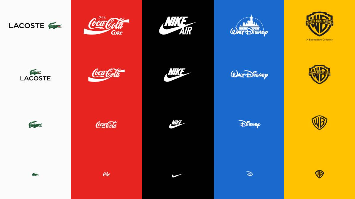
That’s why smart brands don’t just keep shrinking their logo. They create different versions of it—full logo for big spaces, simplified logo for small spaces, and an icon that still feels like the brand.
Same identity. Less stress. Better recognition.
#BrandIdentity #LogoDesign
0 likes · 0 comments · 0 shares